Design A Gift Application
Application for people who want to customize their gifts to be especial for their lovely people.
Role: UX/UI Designer & Product Manager
Tools Used: Figma, Miro
Duration: 2 months
Introduction
The project background
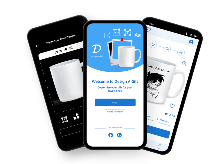
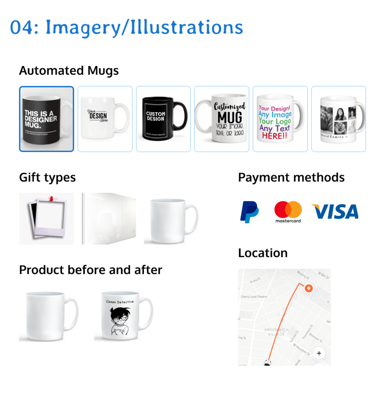
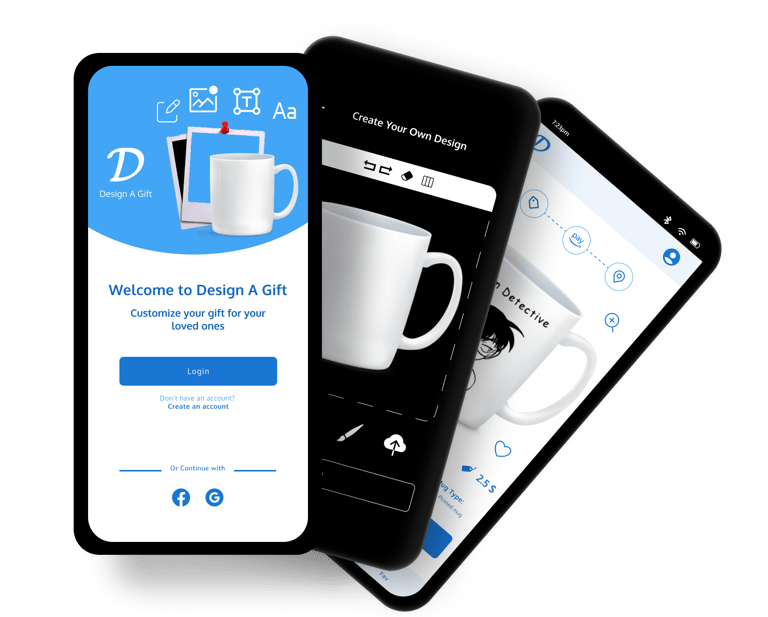
Design A Gift app is a local gift maker. It allows users to design their art, logo, or picture styles in a Mug or a Glass board, or a photo frame. It provides a very simple user interface with a lot of features that do the purpose in a professional way. Design A Gift app targets adults or users aged between 14 - 30 years as they can design a gift for their parents, friends, girlfriends, or boyfriends ...etc
Goal and responsibilities
To make the Design A Gift app that will make it easy for users to apply their own vision and design style in Mugs or Glass Boards or photo frames, we have to go through the full UX design process in order to solve the problem in the best way and professionally so our responsibilities will be centered in Conducting interviews, paper and digital wireframing, low and high-fidelity prototyping, conducting usability studies, accounting for accessibility, and iterating on designs.
Solution
How it works
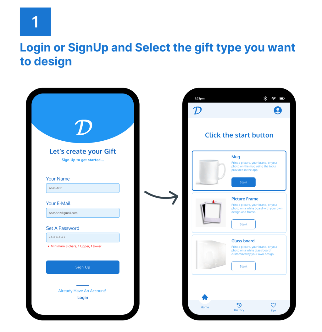

Phase 1
Understanding the user doing the foundational UX research
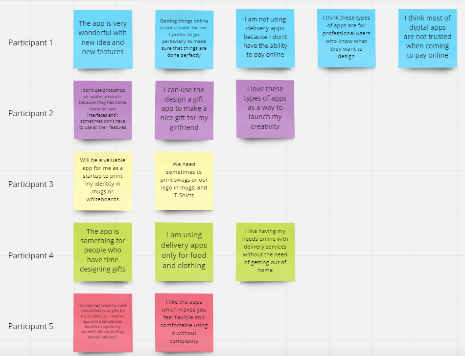
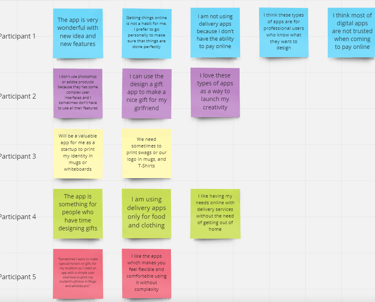
During the UX Research, I made sure to collect a large number of insights and data to ensure that my design will address the purpose professionally. I conducted interviews and created empathy maps to understand the users I’m designing for and their needs.
The first user group which was between 16 - 25, confirmed that the app is so helpful and useful for them to design a simple gift for their mothers on mothers' day. Also, they confirmed that the crux is the simplicity of the app as it is not complicated.
Discovery and Analysis
Since our product is in its first phase, our team focuses to understand
the app s effect on users and if the app will make a value for large capacity of users. I interviewed 5 users with different backgrounds to
know their pain points and expectations about the app and the value
that our app will provide. We mainly focused on adding some more
features on the app to make it more attractive for users so we got a lot
of findings and insights through the UX research.
Findings and Insights:
87% of users are enthusiastic about using our product Users will use the app once it provides a simple user interface with no many complex functions or photoshop ads for example.
The app will be a valuable thing for new startups because they can
Print their logos or visual identity using our material and features provided on the app.Just we need to add the ability to print on T- Shirts and IDs.
Phase 1
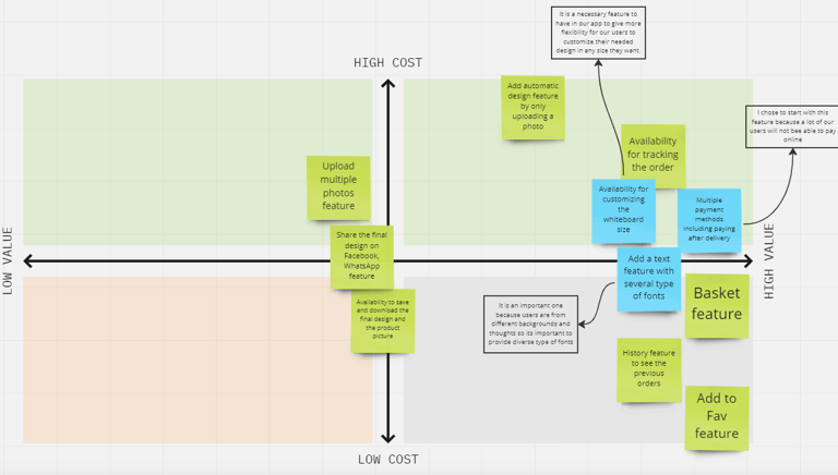
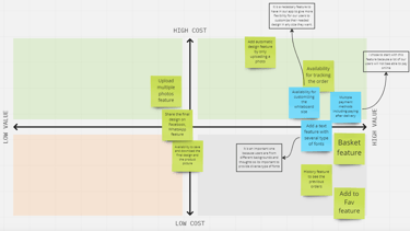
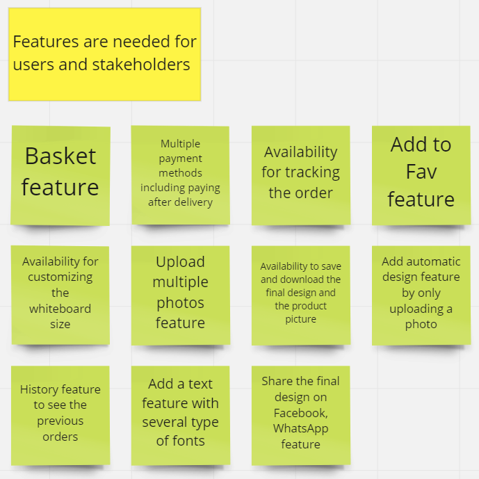
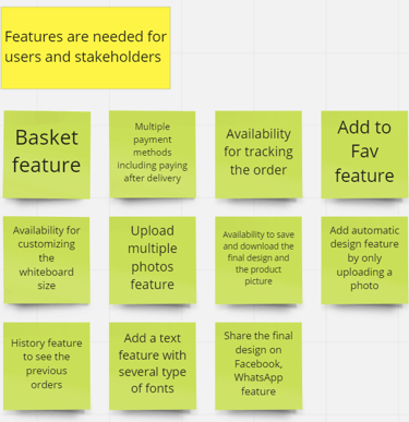
Feature Ideation & Prioritization
We started to set our product's most important features based on the first round of UX research and prioritize the features according to their importance and impact on users.
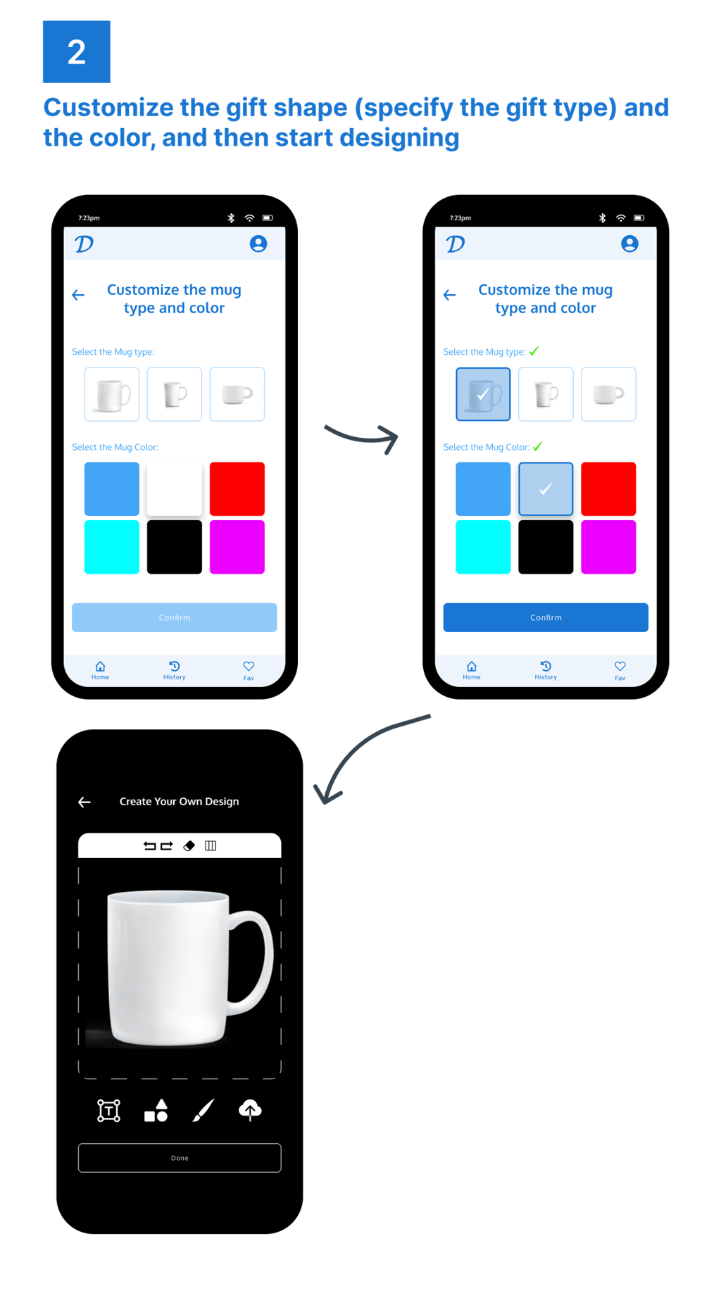
Phase 2
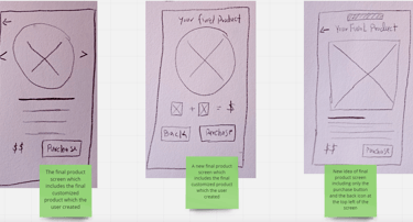
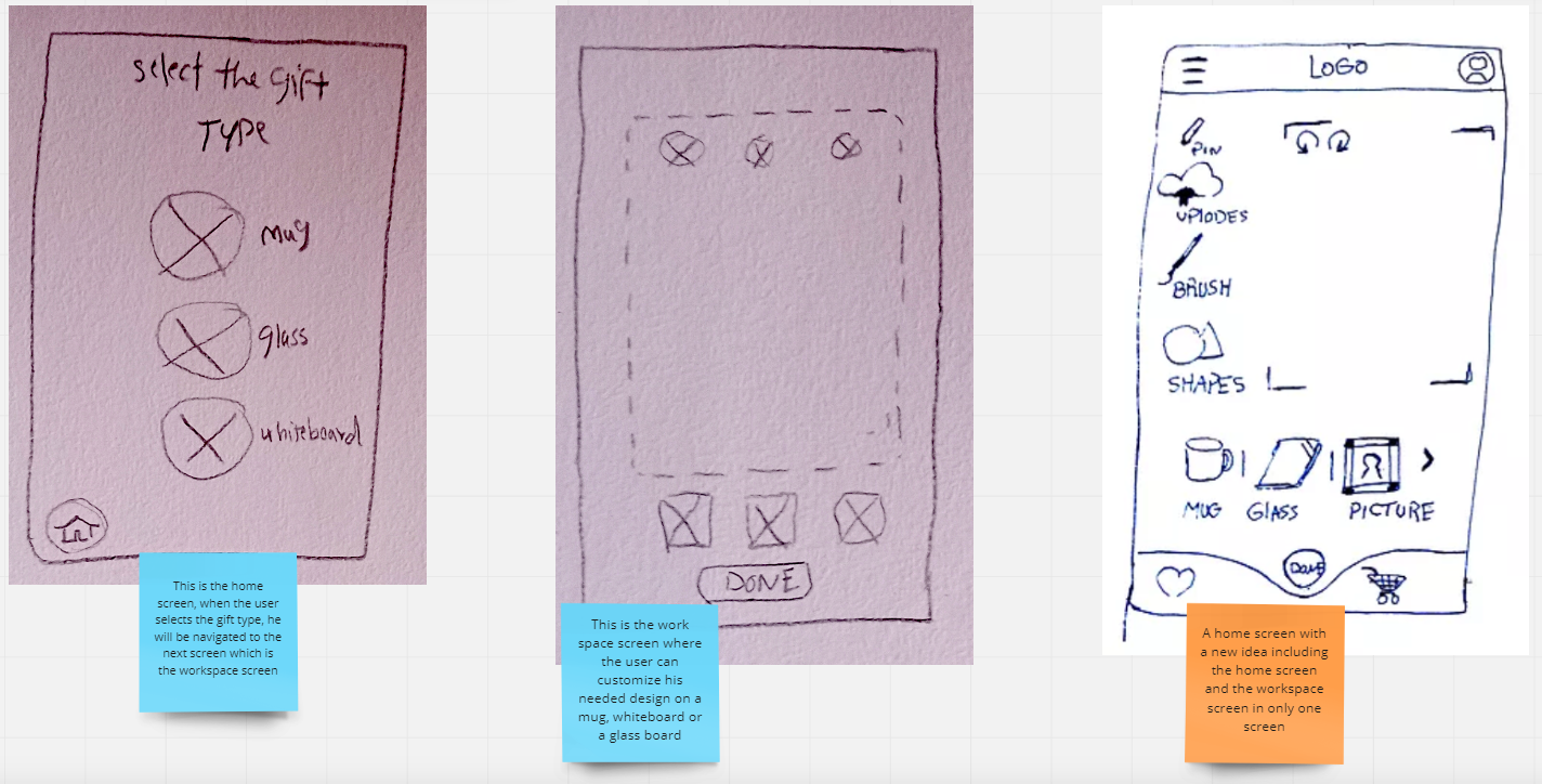
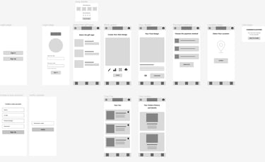
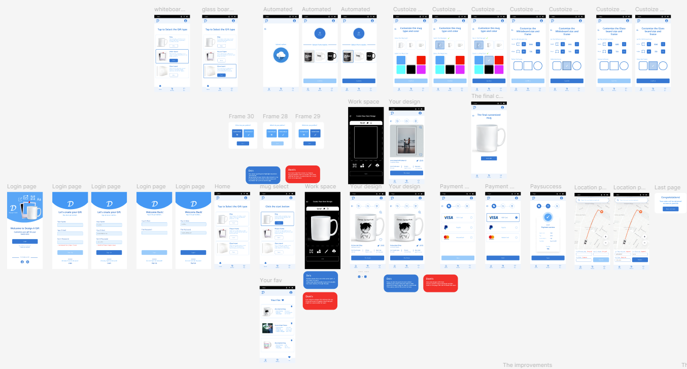
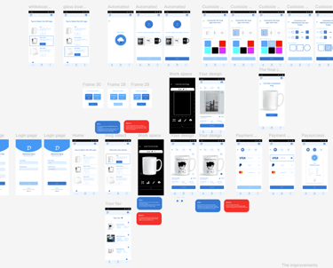
Sketching & Wireframing
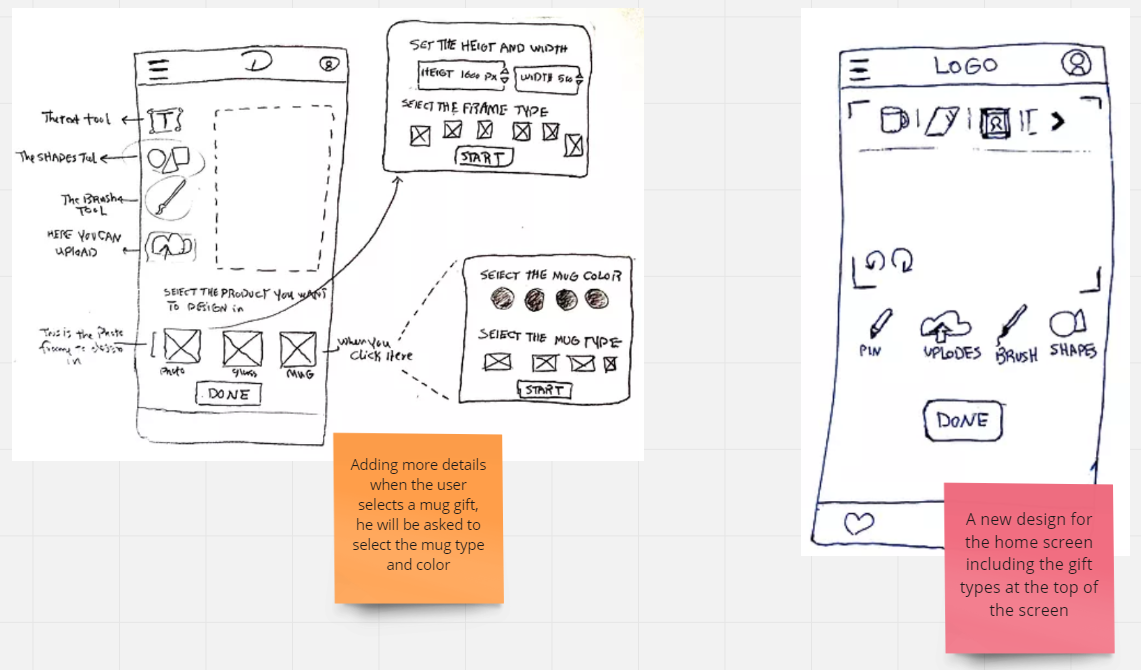
During the paper wireframing, I tried to come up with diverse ideas and solutions to make a simple user interface. I focused on what users said during interviews and tried to come up with ideas that match users' expectations and make the app experience friendly.
From our last research study, we learned that the Design A Gift app will be so valuable for people especially those who are owners of startups or companies. Also, the app will be so valuable for young people. On the other side, we learned that the app needs to include more features and facilities with a diverse set of services not much limited. Based on UX research data, insights, and findings we started the ideation phase with crazy eights. We focused on the important screens to be simple and understandable for users.
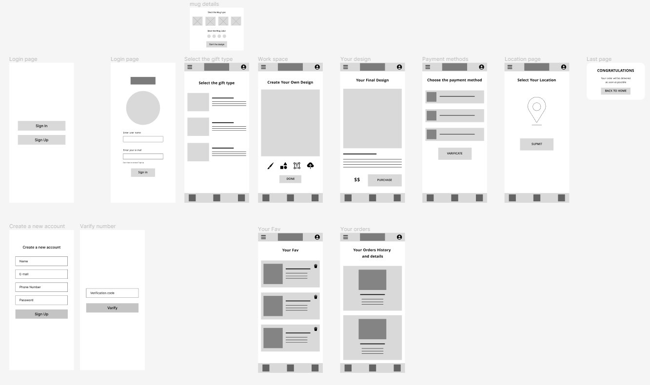
After that, we moved to digital wireframing and prototyping using Figma. We focused to finalize the first version of the app which is the low-fidelity prototype to conduct the first usability study and come up with new insights and iterations.
Phase 3
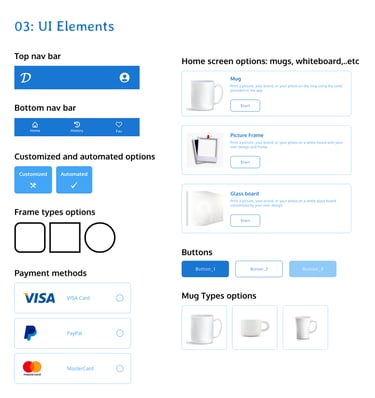
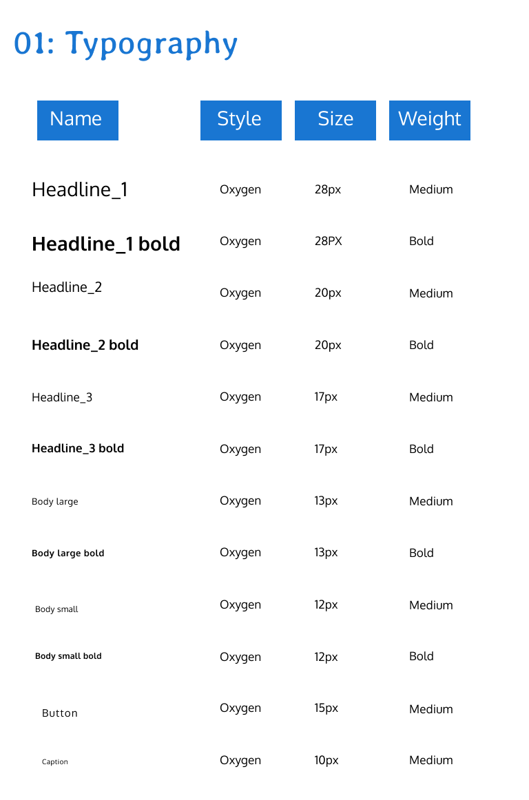
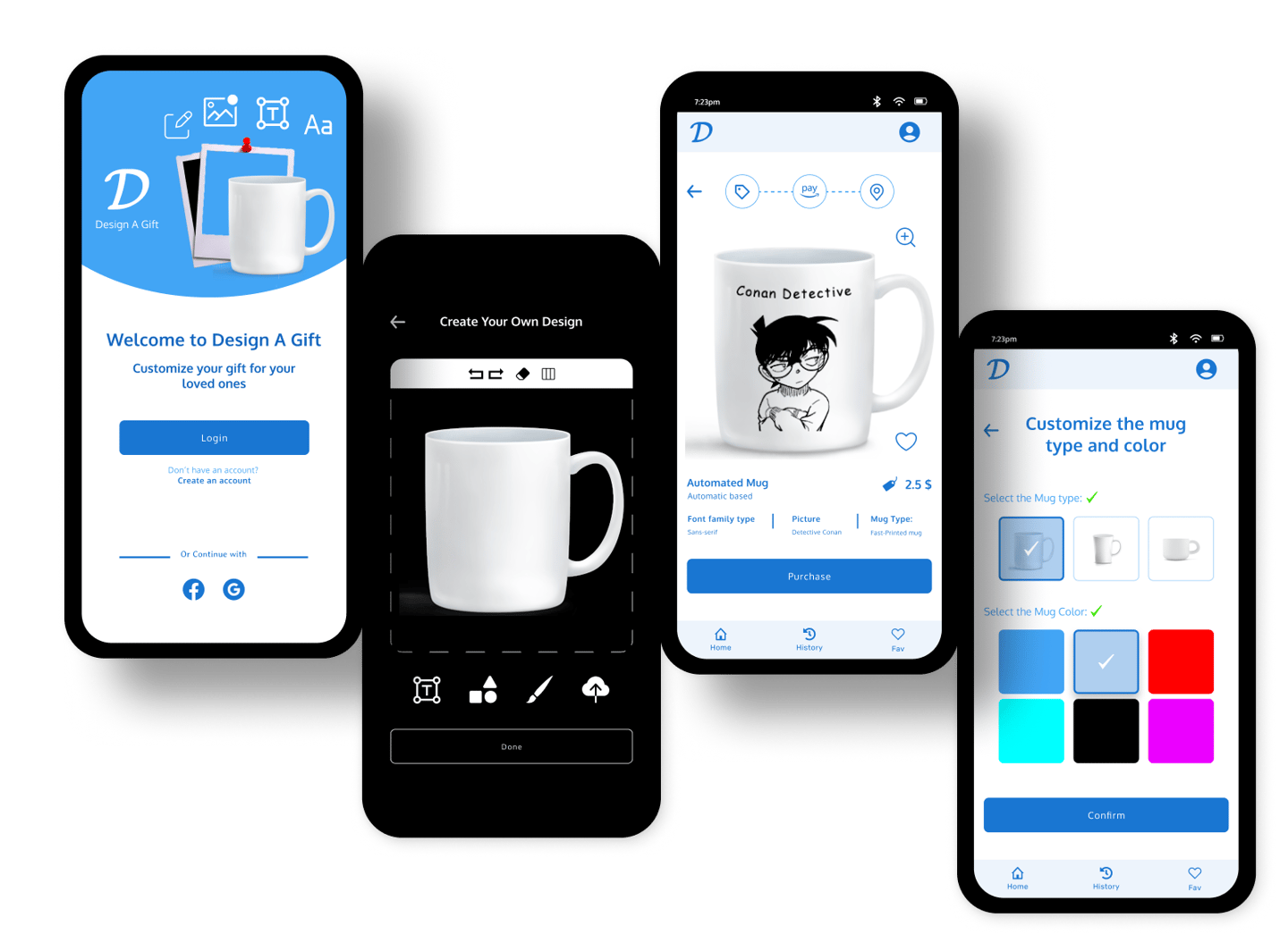
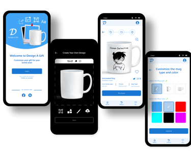
Building the design system and the high-fidelity prototype
During the paper wireframing, I tried to come up with diverse ideas and solutions to make a simple user interface. I focused on what users said during interviews and tried to come up with ideas that match users' expectations and make the app experience friendly.
From our last research study, we learned that the Design A Gift app will be so valuable for people especially those who are owners of startups or companies. Also, the app will be so valuable for young people. On the other side, we learned that the app needs to include more features and facilities with a diverse set of services not much limited. Based on UX research data, insights, and findings we started the ideation phase with crazy eights. We focused on the important screens to be simple and understandable for users.
After that, we moved to digital wireframing and prototyping using Figma. We focused to finalize the first version of the app which is the low-fidelity prototype to conduct the first usability study and come up with new insights and iterations.


Phase 4
Validation, Usability, Feedback
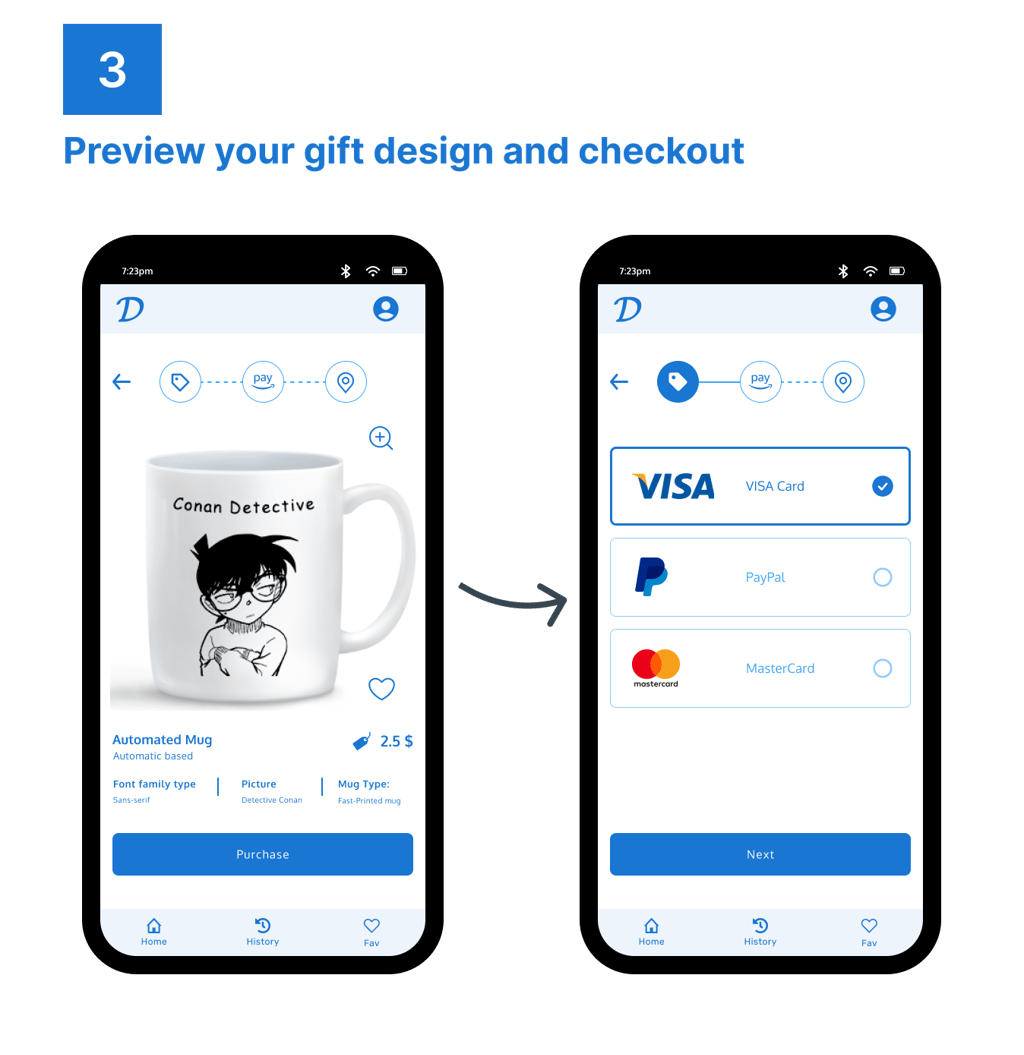
Moving to the second usability study using our high-fidelity prototype, we came up with some insights and feedback:
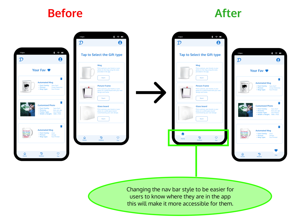
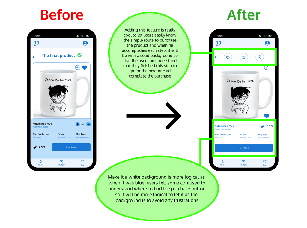
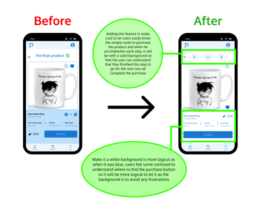
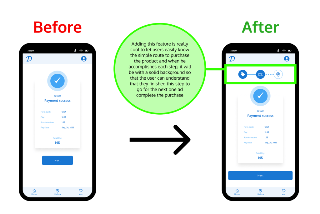
I noticed that 25 % of users drop off rate at Select the payment method and continue” part of the flow.
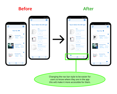
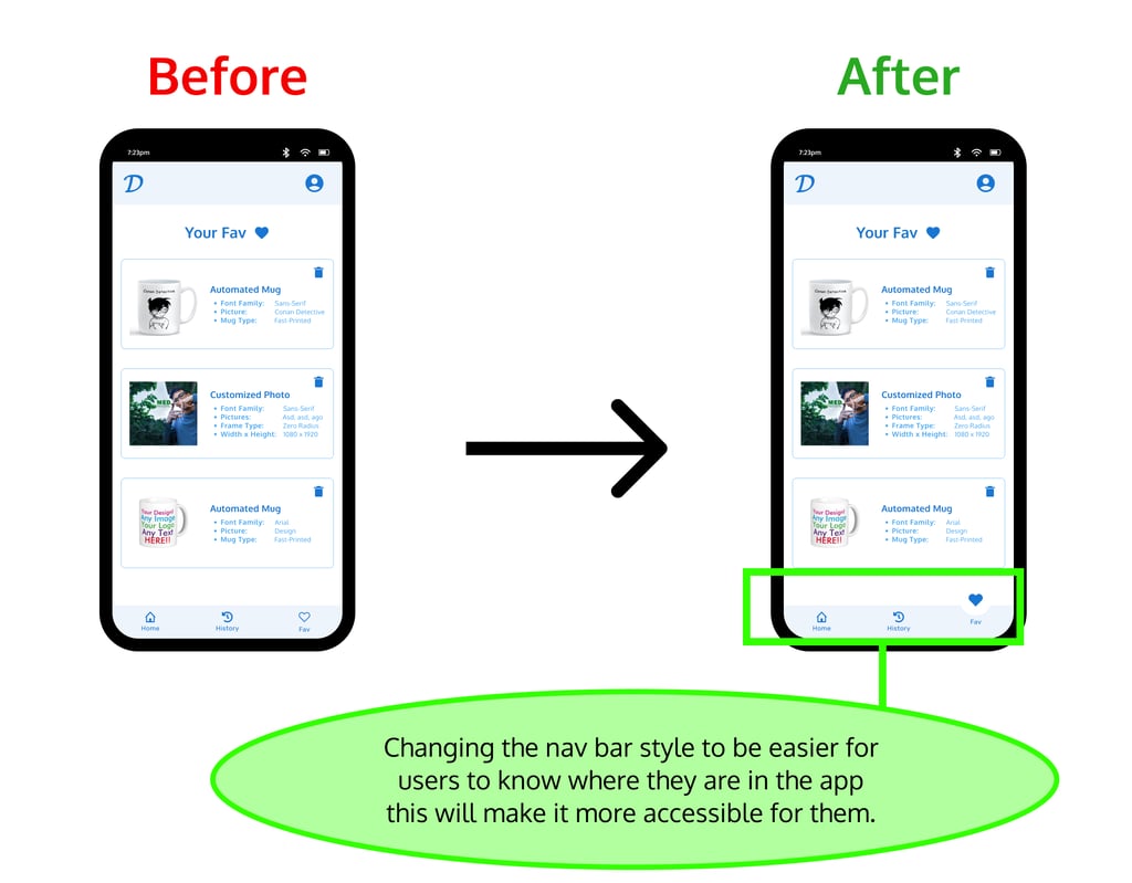
Changing the nav bar style to be easier for users to know where they are in the app
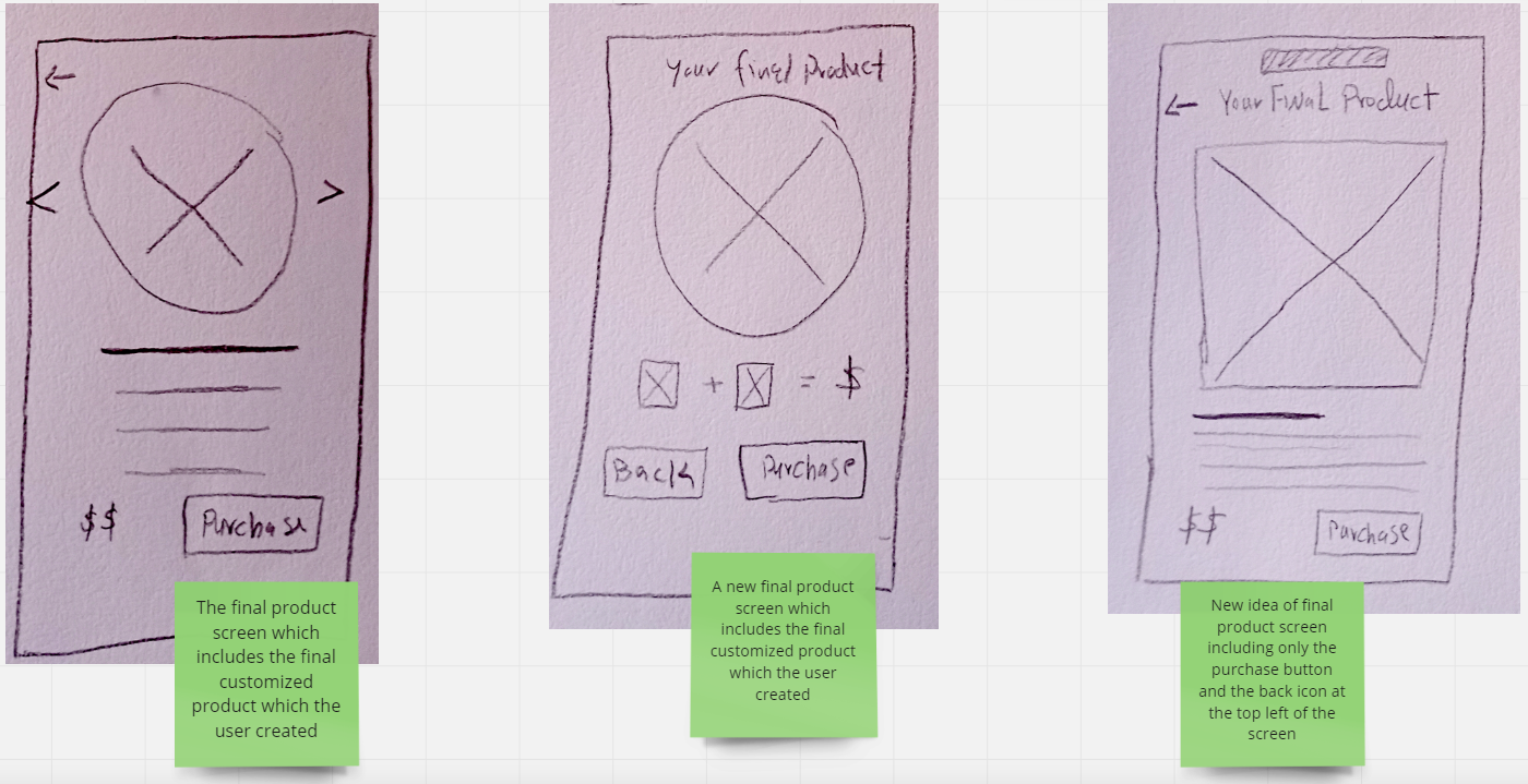
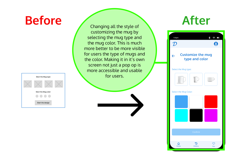
I interviewed the user who made some mistakes and drop off before completing the purchase phase to understand why he couldn't continue, and he explained that he wanted to know what will be next If he will navigate to pay directly or the location page! So I suggested putting the feature of road map for purchasing the product so that users can know the simple road map as a clear route in the top of the app once they reached the final product screen.
I chose to iterate on the screen of “ Select the Mug workspace from the home screen“ specially iterating on the nav bar to make it change depending on the screen where the user is as if the user for example is in the home screen, then the home icon will be solid and stand out of other nav bar icons to give an expression for user that he is in the home page and so on.
I also chose to iterate on the screen of “Select the payment method and continue “adding the feature of purchase road map.

Final Design & Outcome
Users are now able to use Design A Gift easier with no complex functionalities, just the minimum features as needed for end-users who have no technical or design background.
Reach out to me!
Expect to hear from me 2 days after submitting the contact form or sending me an email. Excited to work with you :)
mahmoudessamsalm@gmail.com
Mahmoud Essam
Crafting exceptional user experiences that balance between users' and business needs.
CONTACT
mahmoudessamsalm@gmail.com
© 2025. All rights reserved.